 |  |  |  |  |
|---|---|---|---|---|
 |  |  |  |  |
 |
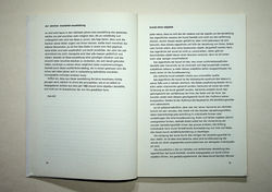
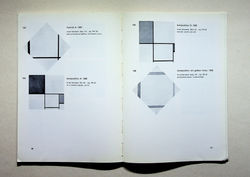
Max Bill. Piet Mondrian. Zürich : Kunsthaus Zürich, 1955
“Text set without capitals have something hallucinatory about them, a very special, unique beauty, so that one often forgets the pragmatic reasoning which led to this writing style (...) Bill's catalogues for his own exhibitions are often of such seductive beauty that it is difficult to escape the suggestive effect. Is this now the irrational element in his often so rationally-planned typography? The subtly designed catalogue, piet mondrian for the Zurich Kunsthaus in 1955, not only does not use capitals, in the bibliography, the normal weight Monogrotesk is mixed with a lighter version, so the appearance of the page, because of the small difference in the strength of the strokers, is diffuse.”
Hans Rudolf Bosshard. "Concrete art and typography". In: Max Bill: typography, advertising, book design. Sulgen, Zürich: Niggli, 1999 (p. 82)
