 |  |  |  |  |
|---|---|---|---|---|
 |  |  |  |  |
 |  |  |
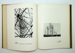
Vasily Kandinsky. Punkt und Linie zu Fläche. München: Albert Langen, 1926 (Bauhausbücher; 9)
“The presentation and typography of the series, with the exception of three volumes, were designed by Moholy-Nagy. The slim volumes all had a yellow linen binding; the decoration was functionally simple, consisting of vertical and horizontal red lines, letters forming the word 'Bauhaus' with the number and title of the volume. The powerful Bauhaus bold type of the inner title pages and the horizontal bands separating the different parts of the text, give an impression of clarity and balance, and produce an agreeable visual effect. However, in a departure from both Bauhaus principles and Moholy-Nagy's own ideas, the conventional typography of lower and upper-case letters was employed, rather than lower-case only.”
Krisztina Passuth. Moholy-Nagy. London: Thames and Hudson, 1985 (p. 44)
